Introduction
Developmental researchers will often use mixed-effects models or growth curve analysis to analyze change over time for a particular variable. These models allow researchers to test the effects of particular variables on the intercept and slope of a dependent variable across time. However, one might also be interested in quantifying not only intercepts and slopes but also residual variance and/or model fit statistics. As such, the following post tries to unpack a possible way to fit individual linear models to a list column for every case contained in a dataset. By extracting parameters from these models, such as R2 or deviance, information beyond simple intercepts and slopes can be obtained and used in other analyses. The method utilizes here takes advantage of list columns, which are essentially lists contained within a data.frame and thereby facilitates the storage of lists for every observation or case in a data set in a clean and organized way. Using the nest() and unnest() functions from the R-package tidyr, we can work with these lists efficiently.
Setup
Below are the packages needed to reproduce the results from this post. Be sure to use set.seed() to obtain the exact same results as presented here.
# packages
library(tidyverse)
library(broom)

# ggplot theme
extrafont::loadfonts()

theme_set(
  theme_light() +
    theme(
      text = element_text(family="Lato")
    )
)

# setting the seed for reproducibility
set.seed(4523)
Contrived examples
To illustrate the method conceptually, let’s imagine a few way concrete ways in which the environment could change across time. Specifically, let’s assume that we can measure the environment in a reliable and valid manner across time. Below, I create a dataset containing 10 individuals each with ten measurements of their environemnt. Note that time stamps for these measurements are containted within the time column of this data.frame. Also note that this column is a list column, or a column of lists for each observation.
example_data <- expand.grid(variance = c(0,1), intercept = c(-5,0,5),slope = c(-1,0,1)) %>%
  as_tibble() %>%
  mutate(
    id   = 1:n(),
    time = list(1:10)
  )

example_data
## # A tibble: 18 × 5
## variance intercept slope id time
## <dbl> <dbl> <dbl> <int> <list>
## 1 0 -5 -1 1 <int [10]>
## 2 1 -5 -1 2 <int [10]>
## 3 0 0 -1 3 <int [10]>
## 4 1 0 -1 4 <int [10]>
## 5 0 5 -1 5 <int [10]>
## 6 1 5 -1 6 <int [10]>
## 7 0 -5 0 7 <int [10]>
## 8 1 -5 0 8 <int [10]>
## 9 0 0 0 9 <int [10]>
## 10 1 0 0 10 <int [10]>
## 11 0 5 0 11 <int [10]>
## 12 1 5 0 12 <int [10]>
## 13 0 -5 1 13 <int [10]>
## 14 1 -5 1 14 <int [10]>
## 15 0 0 1 15 <int [10]>
## 16 1 0 1 16 <int [10]>
## 17 0 5 1 17 <int [10]>
## 18 1 5 1 18 <int [10]>With this data structure, we can imagine at least 3 important parameters that could capture different patterns of environmental change:
- Intercepts: mean levels of harshness
- Slopes: the overall trajectory of change over time in the level of harshness
- Residual Variance: fluctuations in harshness around the overall trajectory of harshness
With these parameters, we can visualize different hypothetical patterns of change over time. For example, it is possible to have an overall low, average, or high level of harshness across time with either a negative, flat, or positive trajectory. In addition, each pattern could be characteried by high or low residual variance.
To visualize there patterns, I can unnest the dataset created above and create environmental stress measures as a function of a linear combination of differing intercepts and slopes with either high or low variance.
example_data <- example_data %>%
  unnest() %>%
  group_by(id) %>%
  mutate(
    h_var     = rnorm(10, mean = 0, sd = 5),
    l_var     = rnorm(10, mean = 0, sd = 1),
    stress    = case_when(variance == 0 ~ intercept + time*slope + l_var,
                          variance == 1 ~ intercept + time*slope + h_var),
    intercept = factor(intercept, levels = c(5,0,-5), labels = c("low","medium","high")),
    slope     = factor(slope, levels = c(1,0,-1),labels = c("positive","zero","negative"))
  )
The contrived dataset contains differing hypothetical developmental trajectories with both high and low variance
Low Variance
example_data %>%
  filter(variance==0) %>%
  ggplot(aes(x = time, y = stress)) +
  geom_point() +
  stat_smooth(method = "lm") +
  facet_grid(slope~intercept, scales="free_y") +
  scale_x_continuous("Time",breaks = 1:10) +
  scale_y_continuous("Stress Exposure Level") +
  labs(title = "Low Variance Stress Exposure Trajectories",
       subtitle = "Columns are intercepts, rows are slopes")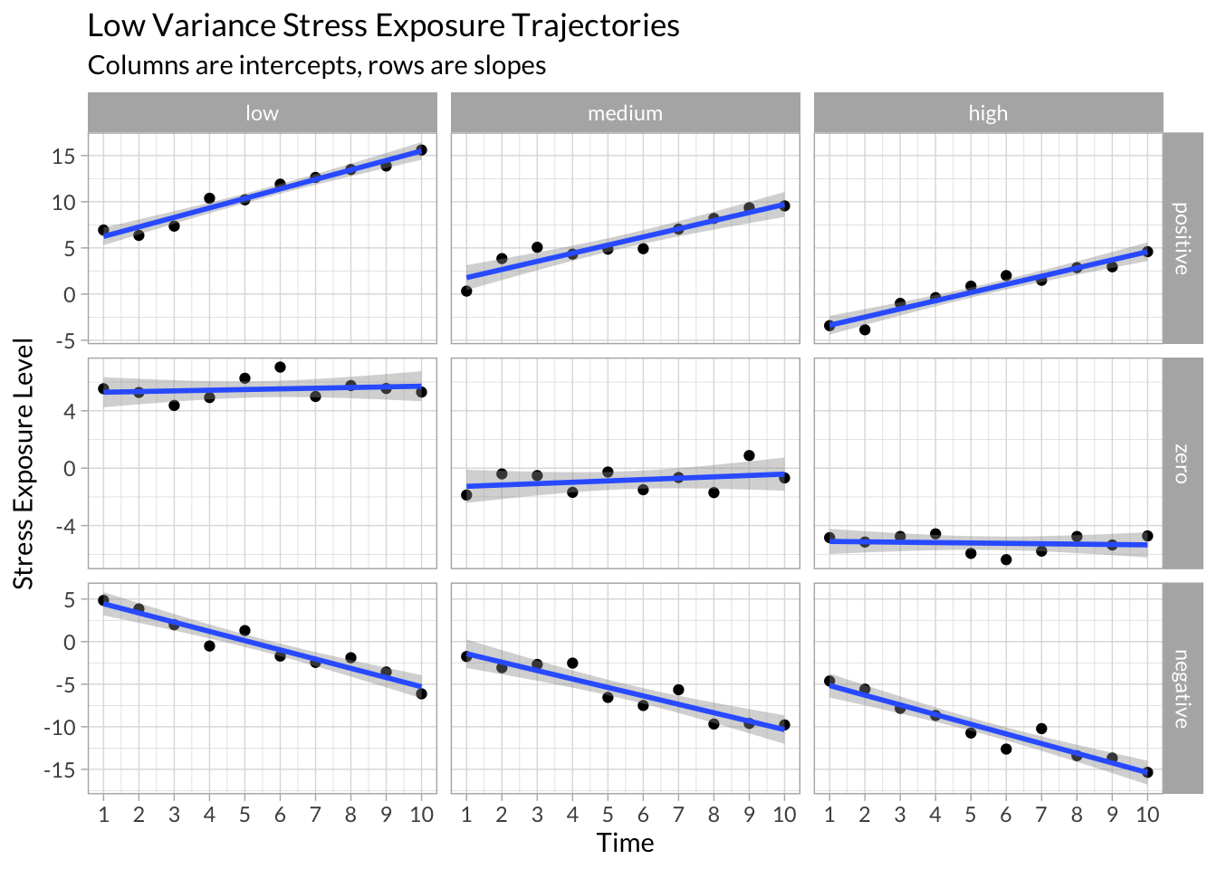
High Variance
example_data %>%
  filter(variance==1) %>%
  ggplot(aes(x = time, y = stress)) +
  geom_point() +
  stat_smooth(method = "lm") +
  facet_grid(slope~intercept, scales="free_y") +
  scale_x_continuous("Time",breaks = 1:10) +
  scale_y_continuous("Stress Exposure Level") +
  labs(title = "Low Variance Stress Exposure Trajectories",
       subtitle = "Columns are intercepts, rows are slopes")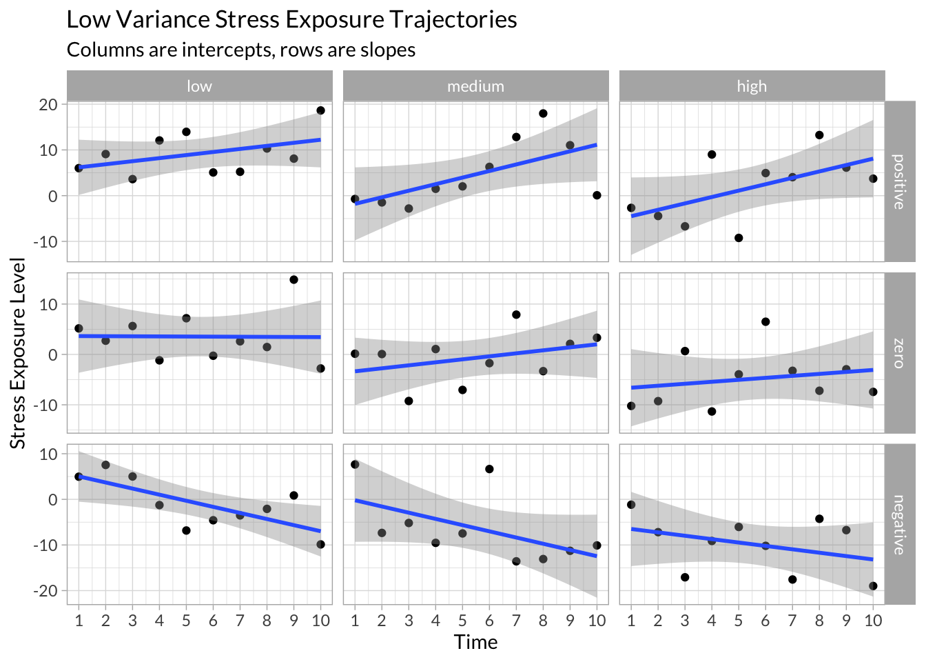
Simulated Empirical Data
Now that we have conceptualized different trajectories of environmental stress across time with varying combinations of intercepts, slopes, and residual variance, we can apply a method for calculating and extracting these parameters for a given longitudinal dataset.
To illustrate, I created random data following the same structure as the examples above. I randomly vary the mean level of stress exposure for each participants repeated measurements of the environment along with randomly varying standard deviations.
stress_df <- map_df(1:10, function(x){
  tibble(id     = x,
         time   = c(1:10),
         stress = rnorm(n = 10, mean = sample(-5:5,1), sd = sample(seq(0,10,.1),1)))
})
Calculate Individual Regressions
Next, we can nest the data to compress each participant’s stress data into a list. By specifying a function that simply calculates a simple regression of stress on time, we can interate of each observation’s stress data contained within a list and save the results in a new list column containing each observation’s regression model.
# Functions
stress.lm <- function(df){
  lm(stress~time,data=df)
}

# Nest Data
stress_df_nested <- stress_df %>%
  group_by(id) %>%
  nest()

# Fit a linear model to each observation
stress_models <- stress_df_nested %>%
  group_by(id) %>%
  mutate(
    stress_lm    = map(data,stress.lm),
    lm_stats     = map(stress_lm,glance),
    lm_coefs     = map(stress_lm,tidy),
    lm_vals      = map(stress_lm,augment),
    lm_intercept = map_dbl(lm_coefs, function(x) unlist(x[1,"estimate"])),
    lm_slope     = map_dbl(lm_coefs, function(x) unlist(x[2,"estimate"])),
    lm_rsqrd     = lm_stats %>% map_dbl("r.squared"),
    lm_deviance  = lm_stats %>% map_dbl("deviance"),
    lm_sigma     = lm_stats %>% map_dbl("sigma")
  )
From each regression, we can extract interesting data, such as the predicted values and residuals values, and overall model parameters, such as the intercept, slope, R2, and deviance.
To unpack these data, we can plot each of the participants data:
# Plot all participants
stress_models %>%
  select(lm_vals) %>%
  unnest() %>%
  ggplot(aes(x = time, y = stress)) +
  geom_segment(aes(x = time, xend = time, y = stress, yend= stress - .resid), color = "red") +
  stat_smooth(aes(x=time,y = stress), method = "loess", se = F,span = 1) +
  geom_point() +
  geom_line(aes(y = .fitted),size=1) +
  geom_point(aes(y = .fitted),shape=21,fill="white") +
  scale_x_continuous("Time", breaks = 1:10) +
  facet_wrap(~id,nrow = 5)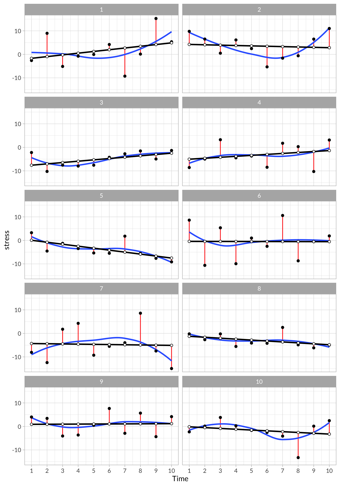
These plots visualize each observation’s trajectory, including their intercept, slope, and residual variance. In addition, we can see a few of the model parameters that we extracted from each individual’s model:
# Regression model parameters extracted from each participant
stress_models %>%
  select(id,lm_intercept,lm_slope,lm_rsqrd,lm_deviance,lm_sigma) %>%
knitr::kable(digits = 2, format = "html", table.attr = "class=\"bordered\"")| id | lm_intercept | lm_slope | lm_rsqrd | lm_deviance | lm_sigma |
|---|---|---|---|---|---|
| 1 | -2.43 | 0.73 | 0.10 | 408.77 | 7.15 |
| 2 | 4.37 | -0.16 | 0.01 | 249.60 | 5.59 |
| 3 | -8.17 | 0.57 | 0.30 | 61.67 | 2.78 |
| 4 | -5.45 | 0.41 | 0.06 | 216.24 | 5.20 |
| 5 | 0.89 | -0.84 | 0.42 | 81.10 | 3.18 |
| 6 | -0.42 | -0.01 | 0.00 | 510.86 | 7.99 |
| 7 | -4.22 | -0.09 | 0.00 | 504.14 | 7.94 |
| 8 | -0.84 | -0.40 | 0.18 | 59.42 | 2.73 |
| 9 | 0.86 | 0.03 | 0.00 | 182.22 | 4.77 |
| 10 | 0.17 | -0.34 | 0.05 | 188.93 | 4.86 |
The main idea here is that we can use this method to extract interesting parameters not normally leveraged in mixed-models and use them in further analysis, such as looking at how residual variance, a potential measure of unpredictability, might be a unique predictor of different kinds of outcomes.
Time Series Analysis
We can also use techniques from time series analysis to describe longitudinal data. For example, we can calculate autocorrelation and partial autocorrelations in a time series or fit autoregression and moving average models (or a combination of the two) to a time series.
Time Series Data
Visualizing Time Series
stress_df %>%
  ggplot(aes(x = time, y = stress)) +
  stat_smooth(method="lm",se=F, alpha = .5, color = "gray")+
  geom_line() +
  geom_point() +
  facet_wrap(~id, nrow = 5)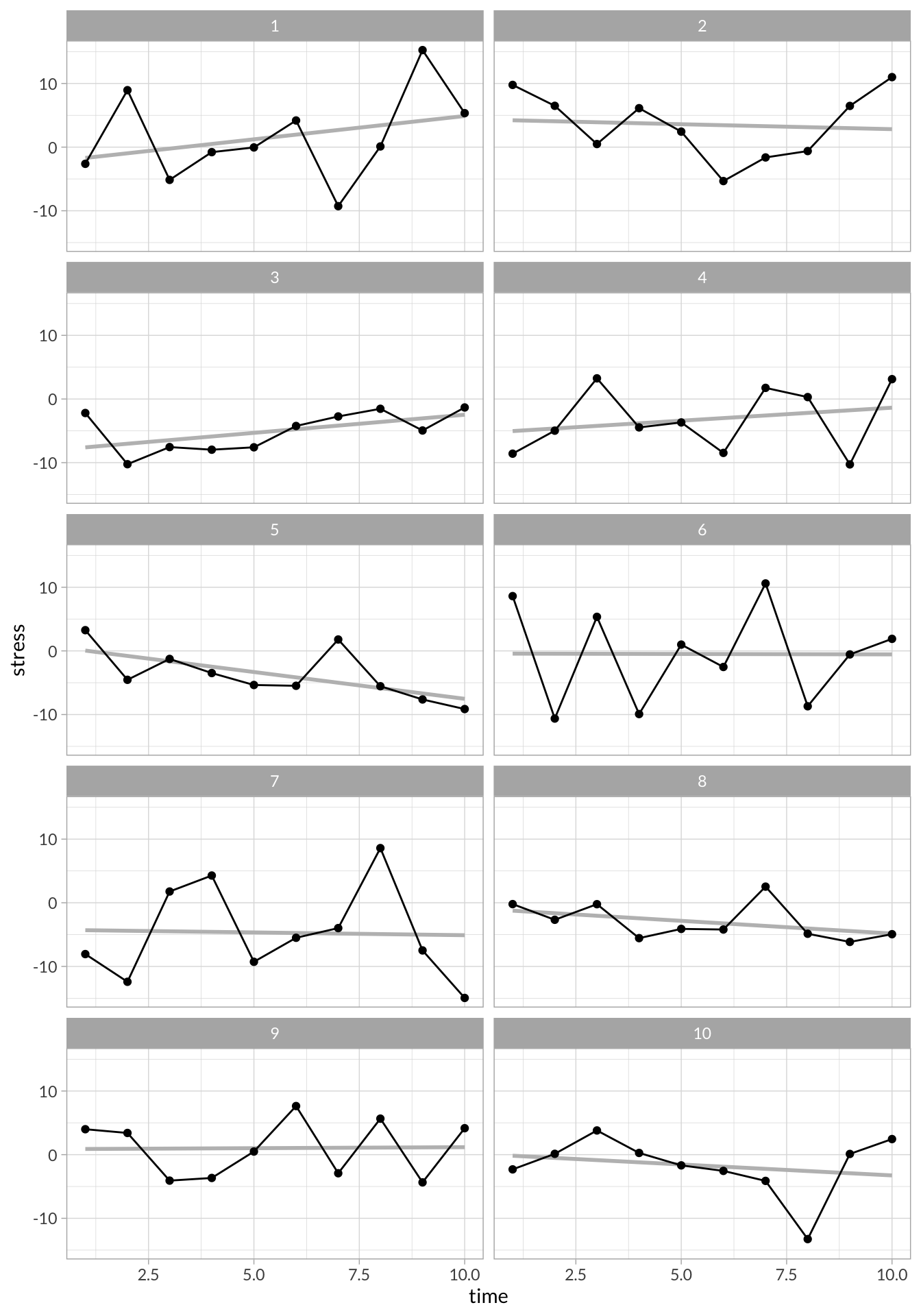
Differenced Time Series
stress_df %>%
  group_by(id) %>%
  mutate(stress_diff = stress - lag(stress)) %>%
  filter(id %in% c(1,2)) %>%
  gather(key,value,-id,-time) %>%
  mutate(key = factor(key,c("stress","stress_diff"),c("Raw","Differenced"))) %>%
  ggplot(aes(x = time, y = value)) +
  geom_line() +
  geom_point() +
  stat_smooth(method="lm",se=F) +
  facet_grid(id~key)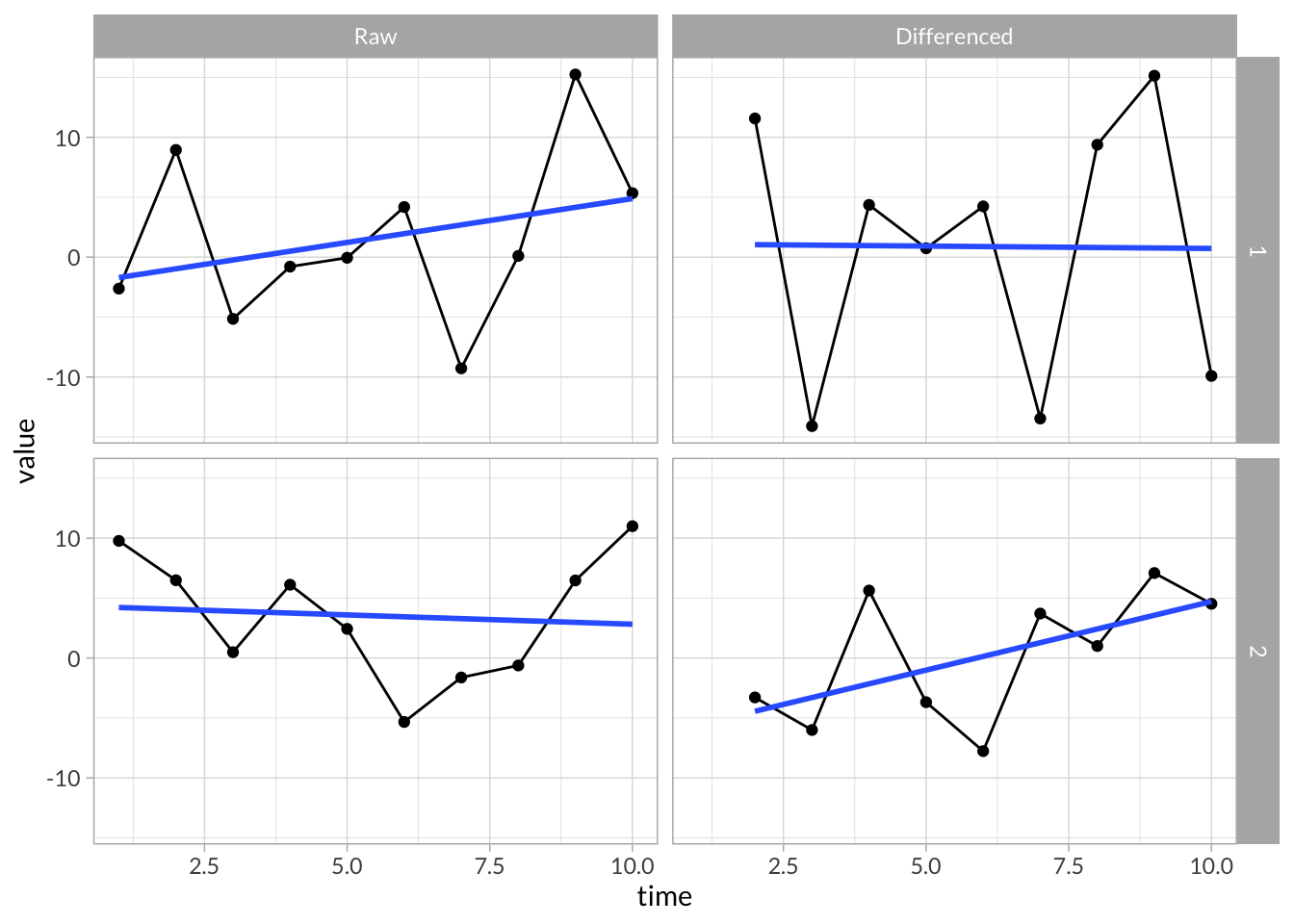
Autocorrelation
# Define custom autocorrelation functions
stress_acf <- function(df,index){
  df %>% pull(index) %>%  acf(plot=F)
}

stress_pacf <- function(df,index){
  df %>% pull(index) %>%  pacf(plot=F)
}

# Run Auto and Partial autocorrelation functions on each participants time series
stress_df_tseries <- stress_df %>%
  group_by(id) %>%
  nest() %>%
  mutate(
    acf       = map(data,stress_acf,2),
    pacf      = map(data,stress_pacf,2),
    acf_data  = map(acf,function(x) data.frame(lag = x$lag, r = x$acf)),
    pacf_data = map(pacf,function(x) data.frame(lag = x$lag, r = x$acf))
  )
Visualize Autocorrelations
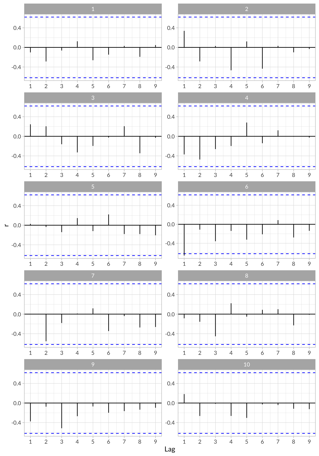
stress_df_tseries %>%
  select(id,acf_data) %>%
  unnest() %>%
  ggplot(aes(x = lag, y = r)) +
  geom_hline(aes(yintercept = 0)) +
  geom_hline(aes(yintercept = qnorm((1 + .95)/2)/sqrt(10)),linetype = "dashed", color = "blue") +
  geom_hline(aes(yintercept = qnorm((1 + .95)/2)/sqrt(10)*-1),linetype = "dashed", color = "blue") +
  geom_segment(aes(x = lag, xend = lag, y = 0, yend = r)) +
  scale_x_continuous("Lag",breaks = 0:9) +
  facet_wrap(~id,nrow = 5,scales = "free")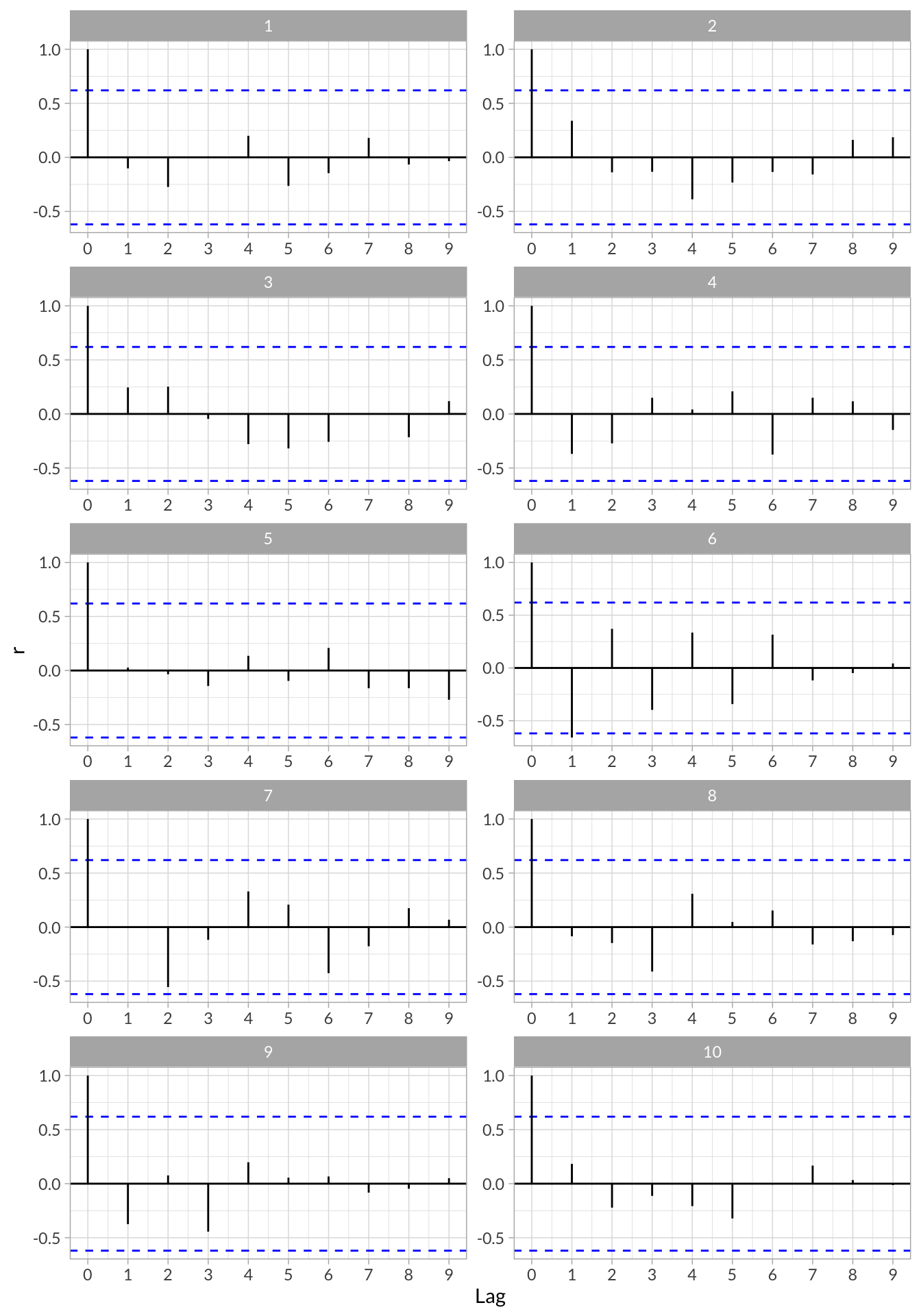
Visualize Partial Autocorrelations
stress_df_tseries %>%
  select(id,pacf_data) %>%
  unnest() %>%
  ggplot(aes(x = lag, y = r)) +
  geom_hline(aes(yintercept = 0)) +
  geom_hline(aes(yintercept = qnorm((1 + .95)/2)/sqrt(10)),linetype = "dashed", color = "blue") +
  geom_hline(aes(yintercept = qnorm((1 + .95)/2)/sqrt(10)*-1),linetype = "dashed", color = "blue") +
  geom_segment(aes(x = lag, xend = lag, y = 0, yend = r)) +
  scale_x_continuous("Lag",breaks = 0:9) +
  facet_wrap(~id,nrow = 5,scales = "free")